|
|
Graphing |
[FrontPage Include Component] |
|
|
|
|
|
|||||
|
NAVIGATOR: Back - Home > Adi > Services > Support > Manuals > Apas > Dos : |
|||||
|
|
|||||
| |||||||||||||||||||
|
Graphing
Categories
|
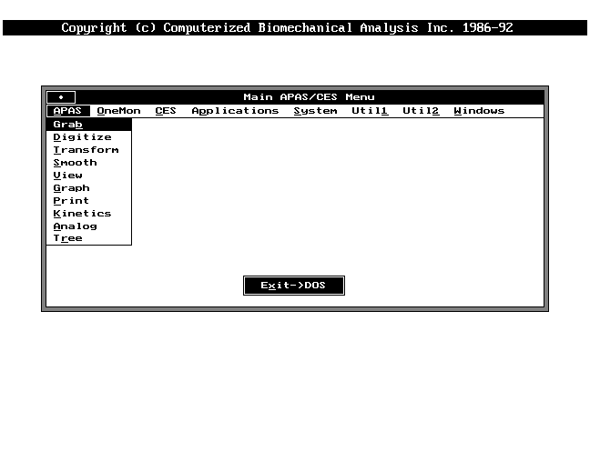
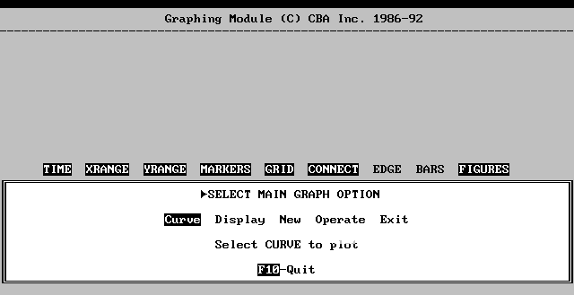
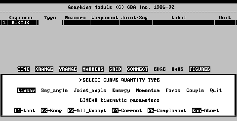
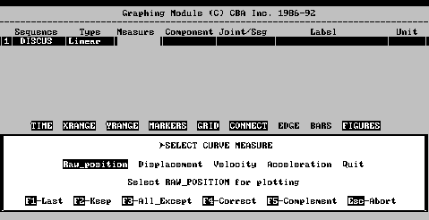
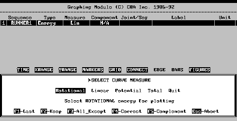
GRAPHING MODULE11.1 GRAPHING OPERATION The Graphing module allows graphing of any of the three-dimensional image data such as, displacements, velocities, accelerations, energy, momentum, and kinetic value, to aid in analysis. The Graphing module is used in conjunction with the viewing and printing modules to obtain a complete presentation of image motion data for biomechanical analysis. When used with the Analog module, graphs of direct analog data measurements form biomechanics force platforms or EMG equipment may be produced. Producing a graph is a two-step process. First, individual data curves are specified and the data values are read and saved by the Graphing module. Second, the actual graph is drawn, using these data curves and option labeling and annotations are added to complete the presentation. The graphing step may be repeated any number of times for a given set of data curves. Different graphing options may be selected to alter the appearance of the graphs in order to highlight specific events or patterns in the analysis data. The graphing module is selected from the Main APAS Menu. The Graphing Main Menu displays four options, Curve, Display, New, and Operate.11.2 CURVES The basic unit of information in the Graphing module is the data curve. Each curve consists of a set of motion values that have been computed from an existing analysis sequence. Motion values refer to displacements, velocities, accelerations, energy and momentum for individual body joints and segments - one value for each frame in the sequence. With the analog option, data curves may also consist of measured analog signal values that have been read from existing analog data files, created in the Analog Module. Motion values are graphed as a function of frame number or time. The individual points are connected by a continuous line since they represent measurements of continuous data. Each set of values are referred to as a data curve, or simply a curve. To specify data curves for graphing, the Curve option is selected from the Graphing Main Menu. When Curve is selected for the first time, or after the New Option is used to start a new graph, either Sequence-(analysis) or File-(analog) must be specified. Sequence-(analysis) option is used to graph motion analysis sequence data, while the File-(analog) option is used to graph analog data files that were created by Analog Module, from direct measurement of output signals from force platforms, EMG equipment, or other types of laboratory transducers. The two types of data curves cannot be mixed on a single graph due to the differing formats. Once the data type has been chosen a table will appear at the top of the screen, with a blinking box under Sequence. This is the Curve Table. The Curve Table will remain on the display as long as the data curve is used during the graphing phase. Up to nine curves may be selected. As each field in the table is filled the blinking box will move to the next filed.
Once a sequence has been chosen the name will be copied to the curve table and a stick figure image will appear on the color monitor. The figure is used to aid in the selection of body joint of segment parameters for graphing. 11.2.2 Type After a sequence has been chosen the blinking box moves to the Type column. This is the type of data curves that are to be graphed. The Quantity Type Menu lists five curve types.
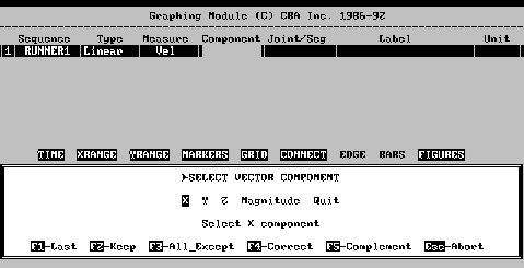
The three components may be combined to produce a vector resultant. Since vectors cannot be graphed, the extent of these resultants may be selected with Magnitude. Magnitude values are unsigned and have no implicit direction. They are reported in the units of measure selected for this sequence. The stick figure may be used as an aid in selecting the proper component. The initial display shows the stick figure as viewed along the Z axis with X direct to the right and Y directed up. If a different viewing direction is selected for this curve, the figure will be re-drawn from that viewing direction. When selecting a vector component remember:
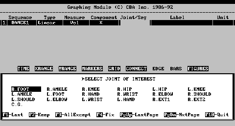
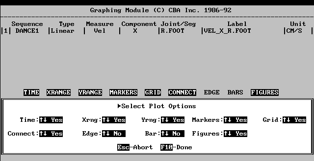
Once a segment or joint has been chosen it will be copied to the curve table and the joint, body segment angle, or body joint angle will be highlighted in a different color on the stick figure. If an angular curve type has been selected, an arc will be drawn on the stick figure to show the angle being measured and reported. F5-Complement may be pressed to select the complement of this angle (360 degrees minus the angle). This allows both interior and exterior joint angles as well as positive and negative segment angles to be reported. Although the F5-Complement function is displayed on each selection menu, it may only be selected in the Joint/seg field and lonely if an angular curve type has been selected. 11.2.6 Label The Label parameter is the label that will be attached to the graph after all curve types have been selected. Any type of descriptive label may be entered. It is recommended that specific, descriptive labels be used to avoid confusion in curves. For instance, if a data curve is selected for the velocity along the X axis of the right foot and another is selected for the segment angle along the X axis of the right foot, it would become very confusing as to which curve is which if each label was Right Foot. However, if one was labeled Vel-X-Rt Foot and the other was Ang-X-Rt Foot, it would be understood which was velocity and angle and what axis they followed. 11.2.7 Finishing Curves After all fields on the Curve Table have been entered a new screen will request final verification by asking: "Get this Curve?". A "Yes" response will cause the data values for this curve to be read and saved for subsequent graphing. A "No" response will cause the selection process to return to the last screen, the Label Parameter, to allow changes in the curve specification. To make corrections or changes, F4-Correct is pressed until the parameter to be changed is highlighted by the blinking box. Select the corrected value then complete the curve selection. F2-Keep may be pressed for any parameter that is not to be changed. Quit may be selected if all the curve specifications are to be cancelled, this ill also return the screen to the Graphing Main Menu. 11.2.8 Selecting More Curves After the curve selection is completed the computer will ask if a "New" curve will be selected or to "Quit" the selection. If Quit is selected the screen will return to the Graphing Main Menu with the Curve Table at the top of the screen. New allows for up to nine more curves to be specified. A new line appears on the curve table. New curves can be created quickly by using the F1-Last or the F3-All_Except function keys. As the blinking box appears in a field, the F1-Last key may be pressed to keep the value of the last curve. Alternately, the values for all items with the exception of one may be copied by pressing the F3-All_Except key. The F3-All_Except menu will appear asking which field will be changed. The curve specifications process will continue until all nine data curves have been selected or Quit is chosen at the end of a curve specification. 11.3 DISPLAY The generation of graphs is accomplished by using the Display option on the Graphing Main Menu. The Display Menu is selected to perform one of the number of display oriented graphing options. Included in these options is the actual generation of plots or graphs on the graphic display. Several of these options are allowed only when a graph is actually being displayed. 11.3.1 Graph When the Graph command is select, a graph of the data curves will be displayed on the color monitor. Once the graph has been drawn, the cursor is activated so the location of the graph legend (point marks and curve labels) can be entered. The graph will utilize the selected (highlighted graphing options as shown on the option line immediately above the menu box. The Graph option cannot be chosen without at least one data curve. Each time the Graph command is chosen the graph will be re-drawn, so changes in the graphing options or adding and deleting curves is possible at any time. Position the cursor to the display screen location for the graph legend using the mouse or the arrow keys, the press the mouse button or the ENTER key. Care should be used in selecting the legend location, as it cannot be changed once it has been positioned without re-issuing the Graph command. If a solid line is desired to be drawn at the edges of the display, the F1-Box key may be used before the legend position is entered. The box is for appearances only, though it can be used as an aid in framing copies of graphs that will be photographed or printed. Optionally, the F2-Single Label key allows the insertion of each individual label one at a time instead of in block form. If the graph legend is not desired the F10-Abort key may be pressed. After the graph legend has been placed, the left and right arrow keys are used to select the desired value/figure, displayed at the top of the screen. Pressing the arrow keys will move the indicator bar by one data point at a time. The shift key may be used with the arrow keys to move five data points at a time. The indicator bar may be moved directly to a value/figure by pressing the middle button on the mouse and positioning the cursor at the specific point then pressing ENTER. The arrow keys may then be used to fine tune the value/figure. F10-Exit will exit the graph option back to the Display Menu. 11.3.2 Option The Options Menu is selected to turn on or off, any of the graphing options listed above the menu box. The current status of each of the graphing options is either "On" (highlighted) or "Off" (not highlighted). Selecting an option name from this menu toggles the current status of that option. The current option setting is saved from session to session when the Graphing Module is exited so the options do not have to be reset unless graph formats are to be changed. 11.3.2.1 Time The Time option produces graphs of motion values as a function of time, in seconds, rather than a function of frame number. Since frames occur at equal time intervals, this option does not change the data curves but rather the scale and labeling of the X axis. The analysis system always measures time relative to the synchronizing event in each sequence. This event is defined as time zero and when the time option is selected the synchronizing event corresponds with the origin on the X axis. This feature aids in the analysis of motion parameters when the synchronizing event corresponds to a significant point in time, such as the impact of a racket on a ball. Time zero always corresponds to the first sample for analog data. 11.3.2.2 XRange and YRange The X- and YRange options will produce a break or discontinuity in the X and Y Axis, whenever the range of data values being graphed is an appreciable distance from the origin. Normally the X and Y axis are drawn on a continuous scale from the origin to the maximum values. The XRange and YRange options allow the scale of the corresponding axis to be expanded when the data range would normally leave a large empty area between the minimum data value and the origin.
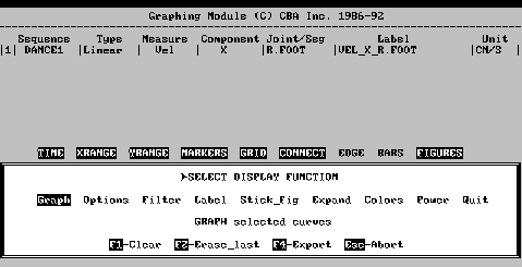
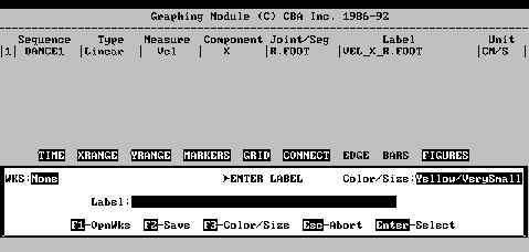
11.3.2.3 Markers The Markers option draws data curve with point location markers. Each curve is drawn with a different marker to aid in distinguishing curves when several are drawn on the same graph. Typical markers are triangles, circles, squares, etc., and the marker for each curve is used in the graph legend to identify the curve (Figure 11-10). The Markers option is normally selected by default. When this option is not selected, data curves are drawn as lines with no point markers. Individual curves may still be identified on the graphic display without point markers by their different colors. 11.3.2.4 Grid The Grid option draws a background grid of horizontal and vertical lines through the tic marks on the X and Y axis. This often aids in determining values at points along the plotted curves. If extensive annotation is to be added to a graph, it is often better to omit grid lines to provide a cleaner background for text and/or stick figures. 11.3.2.5 Connect The Connect option connects individual points along the data curve with lines. This option is normally selected in order to produce graphs with continuous data curves. When this option is not selected, data curves are drawn only as a series of point markers. If both Markers and Connect options are not selected, no data curves will be drawn. 11.3.2.6 Edge The Edge option causes the X and Y axis numbers or values for each of the tic marks to appear at the edge of the graphing area rather than next to the axis. This prevents the numbers from obscuring part of the graph when the X or Y axis are drawn in the middle of the graphing area. 11.3.2.7 Bars The Bars option is selects data curves to be presented in a bar graph or histogram format. Each value on a curve is represented by a vertical bar whose height is the data value. Different curves use bars of different colors which overlay one another. This type of graph becomes difficult to read if there are a large number of curves or data points. 11.3.2.8 Figures The Figures option is selected to toggle the stick figure display option. When Figures is selected the stick figures representing the sequence will be displayed above the graphed information. This option is useful for determining the position of the digitized object at a given point on the graphed data. The coordinates (both horizontal and vertical) for the indicated position are displayed beneath the stick figures. Points of interest on the graph may be selected using the mouse. When figures is not selected the graphs will be displayed using the entire color screen. 11.3.3 Filter< This option is used to smooth graphed curves through the application of the digital filter smoothing algorithm. Normally, joint displacement, velocity and acceleration values will have been sufficiently smoothed in the Smoothing Module.. However, some computed data values, such as, segment and joint angular motion, are combinations of two or three individual joint motion parameters. As such, these curves may not be as smooth as the individual joint curves from which they are computed. The Filter option is provided to perform additional smoothing on such curves, as well as, on analogy data curves which typically are raw and un-smoothed data values. The Filter option smooths the selected curve by removing or attenuating frequencies above the cutoff frequency. Typical cutoff frequencies for biomechanical data range from 5 to 15 Hz or cycles/second. The minimum frequency that may be entered is 1 and the maximum is one half the frame rate for the data curve being smoothed. These values will appear at the top of the menu box as a reminder. After a frequency has been entered, a brief computation will be performed and the graph will be re-drawn with the smoothed curve replacing the original curve. Additional curves may now be selected for smoothing or the same curve may be re-smoothed with a different cutoff frequency. The F1-Ready key may be used to return to the original data values for the curve if smoothing is no longer desired. The F10-Abort key is used to cancel a smoothing request. 11.3.4 Table The Table option is used to produce hard copies of the data values. When this option is selected the Graphing module allows the specification of a horizontal interval along the data curves for the current graph. A printed table is then produced showing the numerical values for each point along each data curve for that interval. The table includes a header identifying each curve for later reference. Using the table option does not change the graph in any way. The mouse or the arrow keys are used to position the cursor to the starting and ending points of the desired horizontal interval to be used in printing data curve values. The mouse button or ENTER key are pressed to select each of the endpoints. Endpoints will be marked by vertical lines on the display to verify range selection. When both endpoints have been selected, a table of curve descriptors and data values will be printed on the system printer. The entire range of the data curves may be selected by pressing the F1-Whole_range key or the F2-Numeric key may be used to enter a minimum and maximum range limit for the table print. Output from the Table option may alternately be saved in a file rather than printed out. Two output file formats are supported by the plotting module. Data Interchange Format (DIF) files are used to move data to a wide variety of commercially available software packages such as spreadsheets and database systems. WKS files are specifically used when table output is to be processed using Lotus123TM or SymphonyTM. File output can be saved in a new file or added to an existing file to allow grouping of related curve values. 11.3.5 Label The effective presentation of data with graphs often requires the addition of titles and descriptive comments as well as the marking and labeling of specific locations and intervals. The Label option is used to add text labels to graphs. When this option is selected, the system asks to "Add" new labels or "Erase" all existing labels. 11.3.5.1 Add Selecting Add allows text labels to be added to the plot or graph. The Label Entry Menu allows options for label size, color and position for the label text. In addition, numeric values or intervals measured from plotted curves may be include in the labels. The current size and color are shown in the upper right corner of the Label Entry Menu.
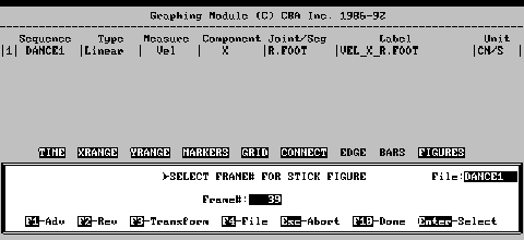
Labels are automatically erased when the "New" command is used and whenever the "Graph" command is re-issued after exiting from the Display Menu.. If labels are to be retained but experimentation of graphing options is desired, then final graphing should be performed prior to exiting from the Display Menu. 11.3.6 Stick-fig In addition to the Label option, the ability to include a stick figure from the analysis sequence with graphed data often aids in the visualization of the motion parameters. The Stick_fig option is used to add stick figure images from analysis sequences to the graph. Stick figures aid in the visualization of an activity whose motion parameters are shown in graph form. Stick figures may be selected for any frame in the sequence and appear by default at the same horizontal position as the plotted data point for that frame. Optionally the stick figure may be translated, scaled, or rated so as not to obscure plotted data. When the stick figure option is selected an initial menu asks whether to "Add" or "Erase" stick figures. 11.3.6.1 Add Add is selected to add stick figures from one or more image sequences to the plot or graph. When this option is selected the Stick Figure Selection Screen will be displayed to allow the choose of sequence, frame number and position of the stick figure on the graph. When the Stick_fig mode is active the stick figure from the middle frame of the sequence is displayed by default. The current stick figure frame number is displayed at the center of the Stick Figure Selection Screen and the corresponding stick figure is drawn at the center of the graphic display. To display another frame, the frame number may be typed into the Frame# box and ENTER pressed or F1-Advance or F2-Reverse may be used to select the desired frame. When the desired stick figure is displayed, the location, size, and orientation may be changed by pressing F3-Transform. When the desired stick figure is displayed in the proper location, the size and orientation changed, the figure may be fixed to the graph by pressing the F10-Done key. Alternately, the stick figure may be removed from the display before it is fixed by pressing the F5-Abort key. Once fixed to the display single figures may not be removed. Also, if a stick figure from another sequence (stick figures are drawn from the current sequence) for any reason, the F4-Sequence key may be pressed. A list of sequence names will be displayed. A sequence is chosen and then the stick figure sequence is followed. 11.3.6.1.1 F3-Transform When a stick figure is first displayed it may obscure parts of the graph, hiding important details. With the F3-Transform key the figures location, size and orientation may be changed.
11.3.7 Expand The Expand option on the Display Menu (Figure 11-9) is used to graph only a portion of the data range of a plotted curve along either the X or Y axes. This option allows portions of the graph to be viewed in greater detail and is often used when a number of overlapping data curves make it difficult to interpret the graphed values. The XRange or YRange graphing options (Section 11.3.2.2) should be selected before using Expand to ensure that only the range selected for expansion will be graphed. An additional menu displays the following:
A new screen will ask for a curve to be selected and the desired type of graph, amplitude or power spectrum, to be examined. ENTER must be pressed after the selection of each entry. The F1-Ready key is pressed to graph the data curves. The current graph is moved to the top of the screen and the power graph is graphed at the bottom (Figure 11-15) Similarly as with other data curves the legend must be placed on the curve. The F10-Exit key will return to the power spectrum menu for any other selections. Power or amplitude graphs are selected and placed one at a time. After all curves have been selected the F10-Exit key may be used to return to the Display Menu. The Function keys displayed at the bottom of the Display Menu are now active. The F1-Clear key will erase the entire display screen in preparation for new graphs. The F2-Erase_last screen will erase the current displayed graph and expand other graphs on the display. The previous graph now becomes the current graph. The F10-Abort key aborts the Display Menu and returns to the Graphing Main Menu. 11.3.9 Colors The Colors option is used to change the colors of the various items used in the graphs. Initially the program assigns a different color to each curve, but these may be changed. Items for which colors can be changed include; the individual data curves, the coordinate axis, the background, the logo at the top of the display, and the optional stick figure that may be added to the display. A new menu presents the items for selection. When an item is selected the color menu will display a selection of sixteen colors. The old color is shown in the upper right corner of the color menu. Color changes are saved when exiting the Graphing Module so colors do not have to be reset each time graphing is performed.
Alternately, if New is not selected, any data curves that are specified after a graph has been displayed on the screen will be added to the list of curves. They will be added to the graph the next time a Graph command is issued. In this manner a graph may be "built up" one or two curves at a time.
11.5 OPERATE Operate is selected to perform certain types of operations or functions one or more of the data curves. These operations affect the data values themselves, not the way the data is graphed or displayed and thus differ from the graphing and display options. Operate options include deleting a curve or combining two or more curves into a new curve using a point-by-point application of a mathematical function. 11.5.1 Formula The Formula option is selected to change the data values for one of the current curves by the point-by-point application of a mathematical formula. Applications for this option include adding a constant to a curve to change its vertical position; multiplying a curve by a constant to change its scale; plotting the sum, difference, product, or ratio of two curves; plotting using the values of one of the curves as the abscissa (X-axis) values; and additional applications limited only by the imagination of the user. When this option is selected an additional display will request a curve number to be entered and a formula to be applied to that curve. 11.5.2 Delete The Delete option is selected to delete or remove one of the data curves from the current graph. A menu of the current curve numbers, corresponding with the data curves listed in the Curve Table, will be displayed.
|
|
|
